
QR Code Printing Checklist: Size, Margin, Contrast and Error Correction
· 4 min read
Contents
- Experiment: how much can you cover?
- The checklist
- 1. Size: at least 2 cm, larger for distance
- 2. Keep the content short
- 3. Leave enough margin
- 4. Dark code, light background, plenty of contrast
- 5. Adding a logo? Use H — and keep it small
- 6. Use SVG for print
- 7. Make sure the link won’t change
- 8. Test-print and scan with real phones
- The bottom line
Print a few hundred menus or flyers with a QR code that phones struggle to read, and you’re printing them again. This post is a checklist of what to verify before you print. We also ran an experiment on the most misunderstood setting — error correction — covering more and more of the center of a QR code to see how much damage each level really survives.
Experiment: how much can you cover?
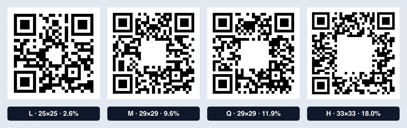
People often place a logo in the middle of a QR code; error correction fills in what the logo hides. We tested how much each level (L, M, Q, H) can tolerate.
- We generated QR codes for
https://kolatools.com/blog/at each level with the same library our QR Code Generator uses (qrcode). - We covered the center with a white square, growing it one module at a time, and checked whether the JavaScript QR reader jsQR could still decode it.
| Level | Nominal recovery | QR size (modules) | Largest cover that scanned | Area covered |
|---|---|---|---|---|
| L | 7% | 25×25 | 4×4 | 2.6% |
| M | 15% | 29×29 | 9×9 | 9.6% |
| Q | 25% | 29×29 | 10×10 | 11.9% |
| H | 30% | 33×33 | 14×14 | 18.0% |
Three takeaways:
- Higher levels survive more damage. Level L stopped scanning with just 2.6% of the center covered; level H still scanned at 18%.
- The area you can actually cover is smaller than the nominal percentage. Recovery is counted in codewords — groups of 8 modules — and a square patch damages many codewords a little at a time. Assume “H tolerates 30%” and make the logo that big, and the code may not scan.
- Higher levels make the code denser. The same URL became 25×25 modules at L but 33×33 at H. Printed at the same size, each module gets smaller, which can hurt when scanning from a distance or with low print quality.
This experiment used a single decoding library. Phone camera apps differ in lighting, focus, angle and decoding method, so results can vary. Always test with real phones before printing.
The checklist
1. Size: at least 2 cm, larger for distance
Even for business cards and handheld prints, 2 × 2 cm (about 0.8 in) or larger is safe. For posters or banners scanned from a distance, a common rule of thumb is a side length of about one tenth of the scanning distance — roughly 10 cm (4 in) if people scan from 1 m (3 ft) away.
2. Keep the content short
The more characters you encode, the denser the code. At the same M level, a 22-character URL took 25×25 modules, while a 110-character URL took 45×45.
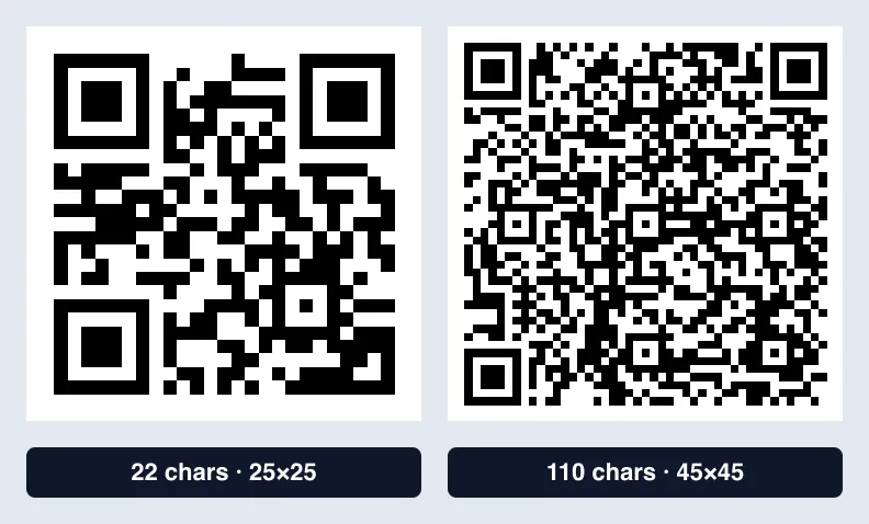
A short URL scans far more reliably at the same print size than one with long tracking parameters.
3. Leave enough margin
The blank border around a QR code (the quiet zone) helps scanners find its edges. The QR standard recommends 4 modules; leave at least 2. Placing the code tight against other graphics or text erases this margin.
4. Dark code, light background, plenty of contrast
Keep the code dark and the background light. If you add color, keep the contrast high. Our QR Code Generator warns you when the contrast drops below 3:1, or when the code is lighter than its background.
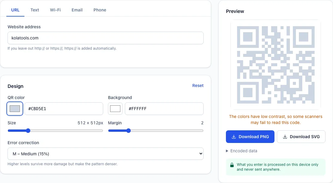
Some scanners can’t read a code that’s lighter than its background (white on dark). If you must go that way, test on several devices.
5. Adding a logo? Use H — and keep it small
With a logo in the center, set error correction to H and keep the logo small — within about 10–15% of the code’s area, based on the experiment above. Without a logo, the default M is plenty; consider Q or H for outdoor prints that may get scuffed.
6. Use SVG for print
A PNG has a fixed pixel size and can blur when enlarged. For print, download the SVG, which stays sharp at any size. The QR Code Generator offers both.
7. Make sure the link won’t change
Our generator makes static QR codes that store the address directly. They never expire, but if the web address inside changes, you’ll need to make and print a new code. For long-lived prints, use an address that won’t change.
8. Test-print and scan with real phones
A code that scans on screen can behave differently on paper. Print one at actual size and test with at least two phones (ideally both iPhone and Android), at the real distance and lighting.
The bottom line
Size, short content, margin, contrast and the right error correction level prevent most “it won’t scan” moments. Try different settings in the QR Code Generator. We covered its features and the data inside each QR type in our QR Code Generator post.